ADCB × Shukran Credit Card
Selling a credit card inside a shopping journey without hurting checkout conversion
- Role
- Product Designer
- Year
- 2024–25
- Project type
- Acquisition, Landing page, Cross-brand touchpoints, 3D
- Tools
- Figma, Cinema 4D
- revenue
- 1.6M AED
- card applications
- 6.4k
- timeframe
- 6 months
Landmark Group and ADCB launched the Shukran ADCB credit card. Every purchase earns Shukran, inside Landmark brands and beyond.
My job was to make our e-commerce sites the card’s main acquisition channel. I owned it end to end, from brief to launch, and led the work with ADCB, the product owner, developers and three brand e-commerce teams.
There was a catch. These are shopping sites. Every banner that sells a card competes with the thing that pays the bills: the order.
The shopper’s mindset
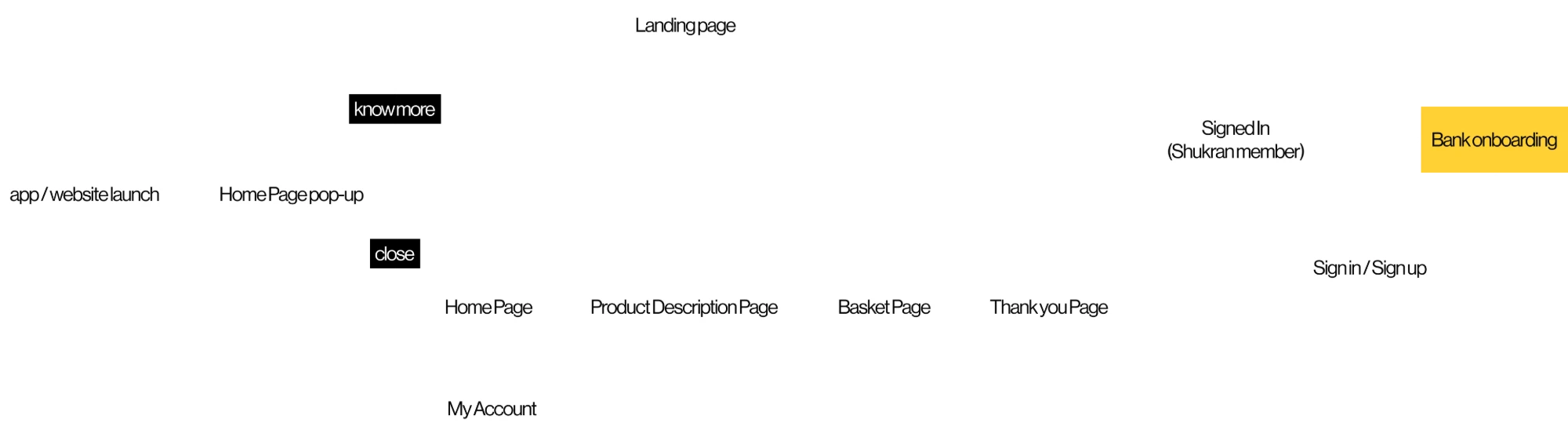
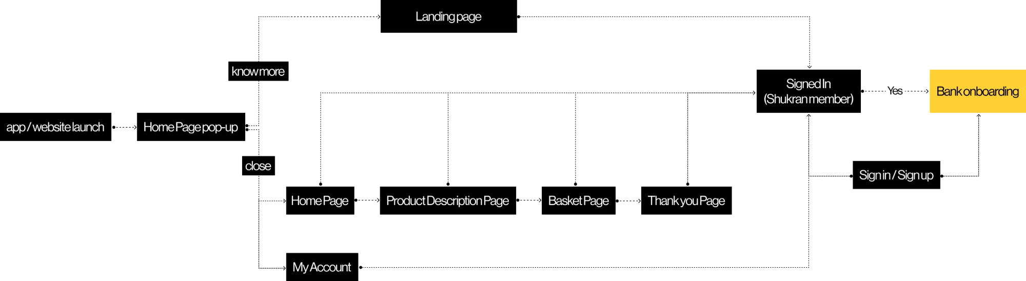
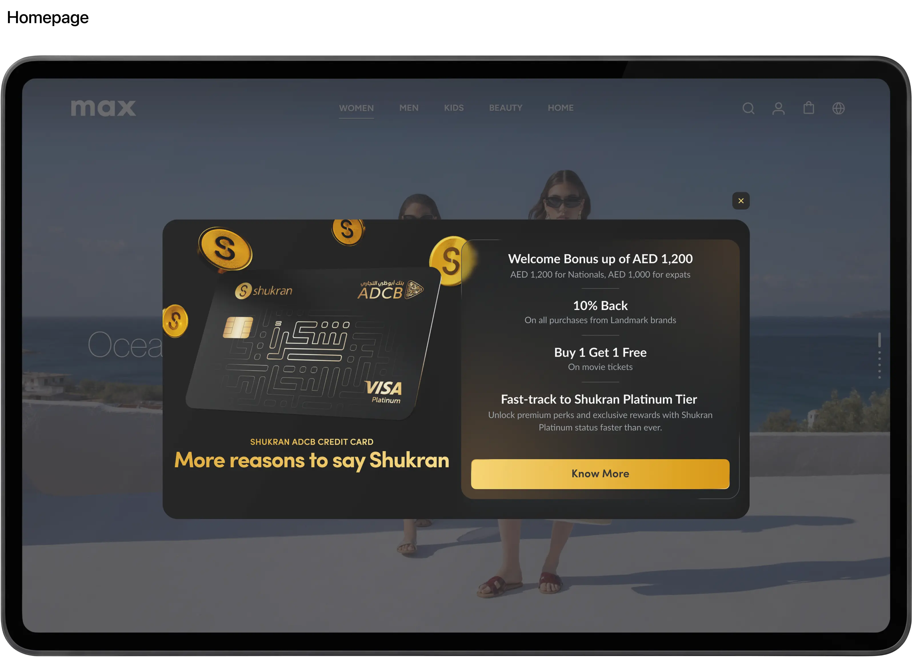
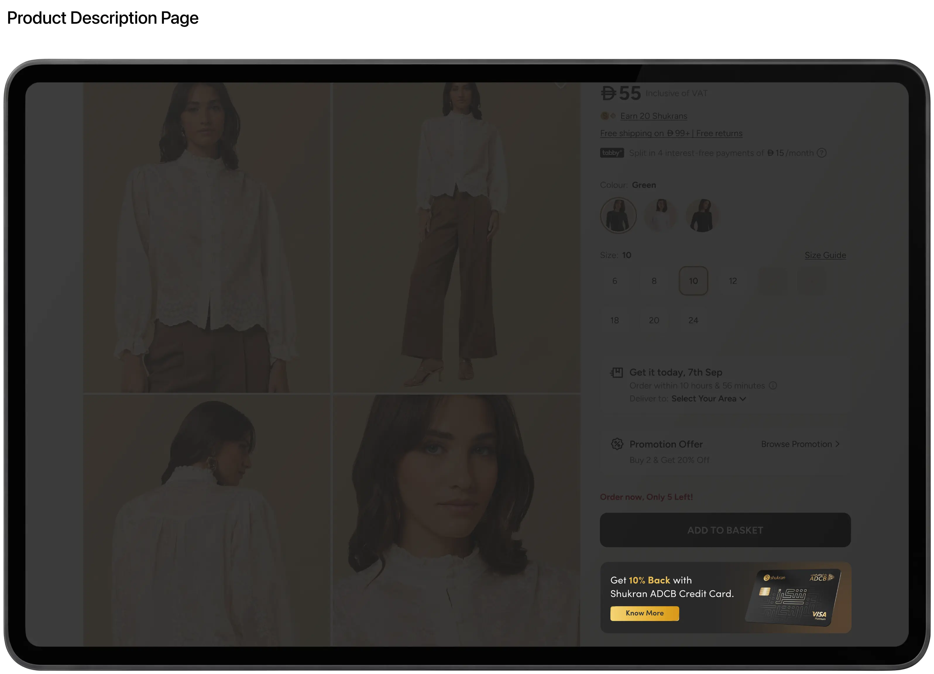
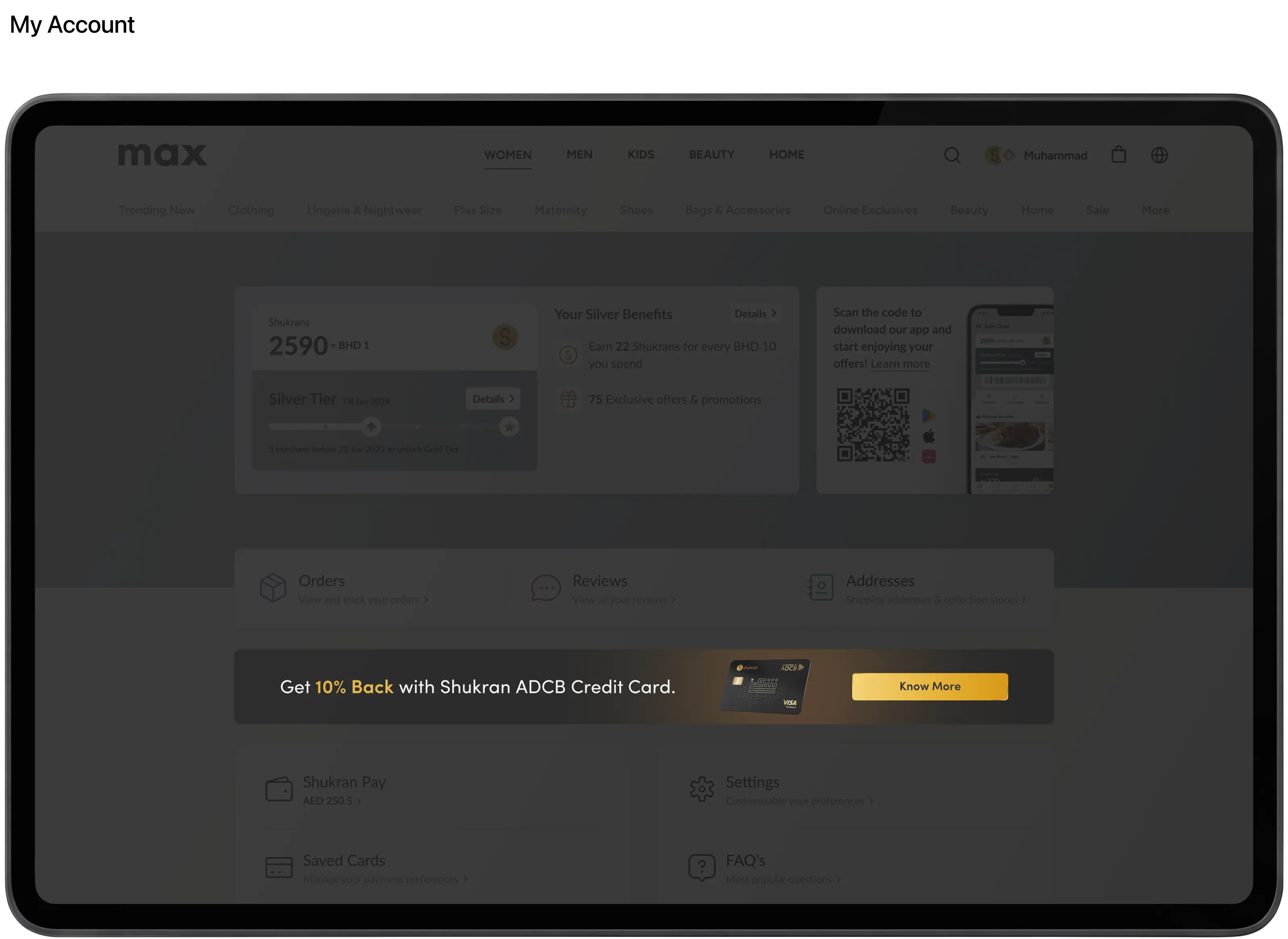
Attention changes as people move through a store. So should the ask.
On the homepage, there’s no task yet. A pop-up meets people when they’re most open.
On product pages, they’re browsing. A banner with a link nudges them without pulling them away.
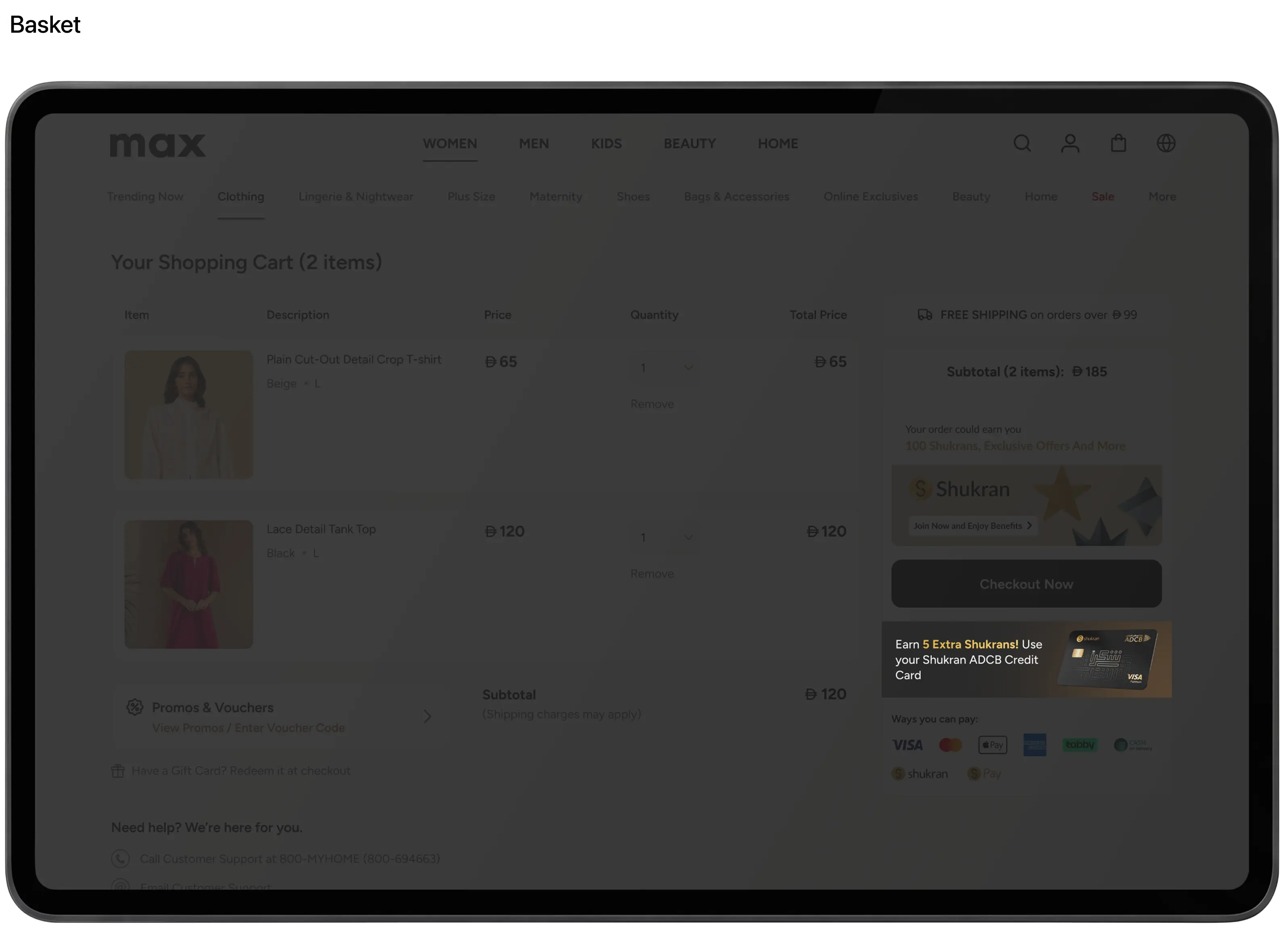
In basket and checkout, they’re paying. The message stays visible but isn’t clickable. Nothing should take them out of the flow.
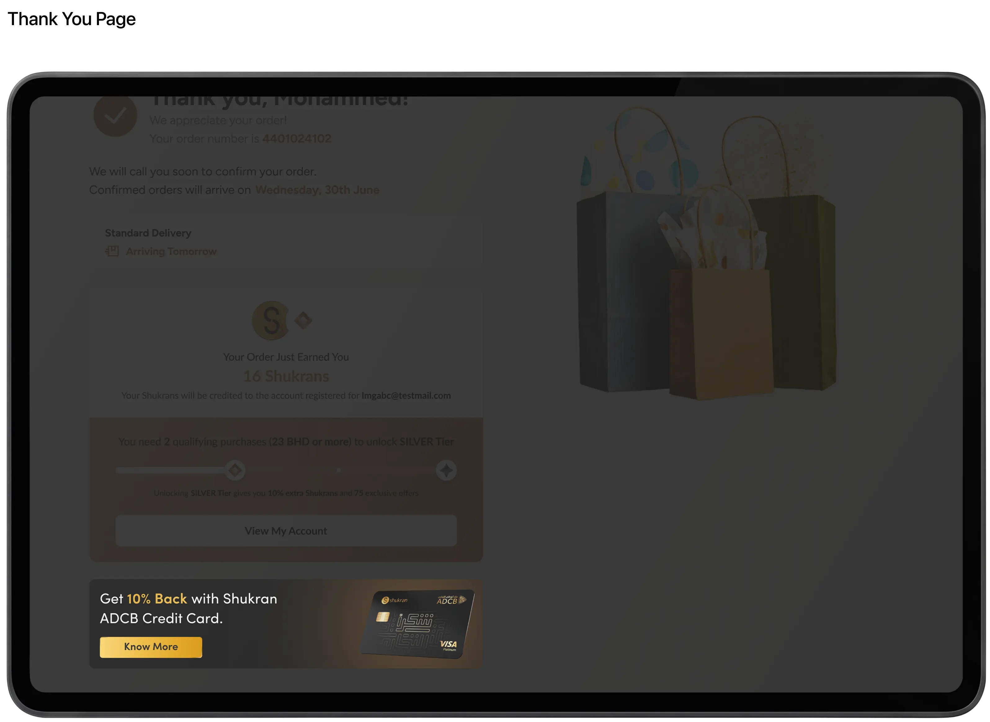
After the order, on the thank-you page and in My account, the ask comes back. The job is done, and they’re open again.
Everyone agreed early: checkout was off-limits for a click. That one rule shaped every other placement.
One number
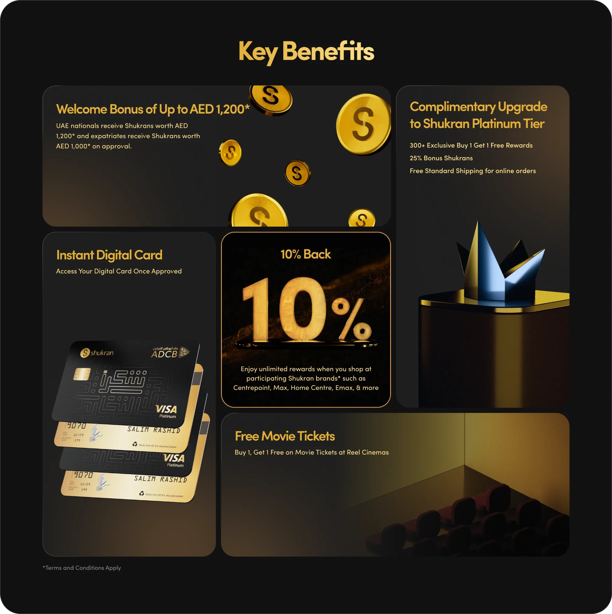
The card had a long list of perks. A list is easy to skip.
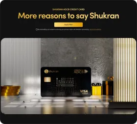
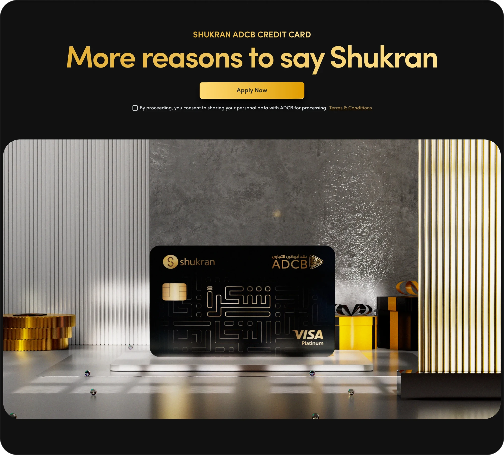
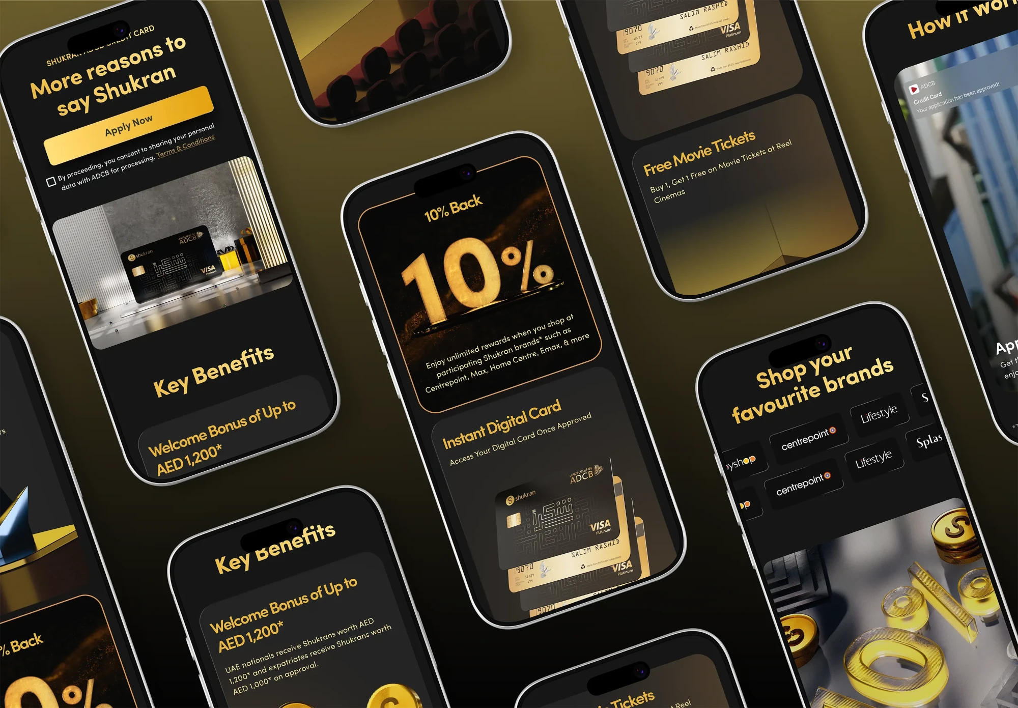
Every competitor led with a single number, and for good reason. I did the same. 10% value back leads. Everything else supports it.
I made all the 3D assets in Cinema 4D, from the card renders on the page to the visuals in every banner. A premium card had to feel premium before anyone read a word.
Easy to apply
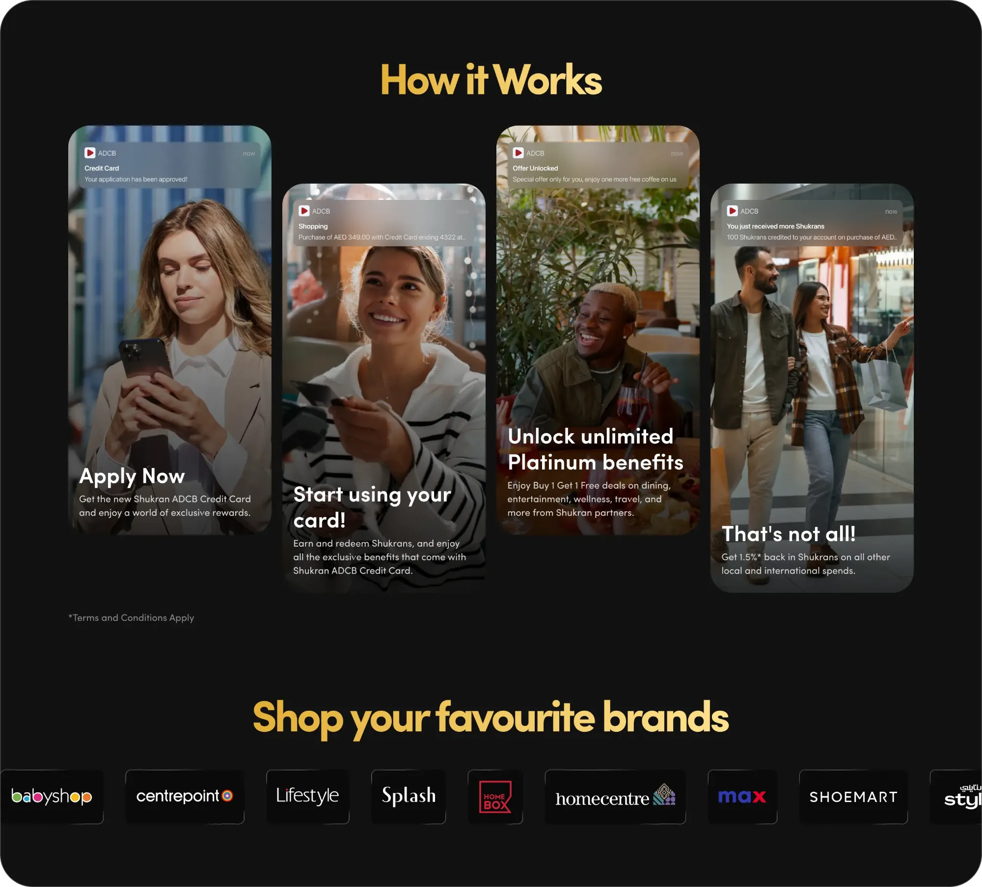
The rest of the page answers the two questions that stop people applying: is this hard, and where can I use it?
Three steps take you from applying to spending. A rail shows the brands where the card earns more. The page closes on the 10% again, with an FAQ for anything left.
Two brands, too many voices
The shopping journey was the easy part. Alignment was harder.
Landmark leadership and ADCB weren’t happy with the card design, and the debate went back and forth over email. I took it out of the inbox. I designed new directions, aligned on them internally, then presented them to ADCB. That gave everyone a clear direction, and after a few more rounds we landed the final card.
The landing page had a different problem: too many voices, especially on the copy. The copy team wrote it, and feedback came from every side. I took on what made the page better and pushed back on what didn’t.
When the feedback kept conflicting, I changed the process instead of the page. I brought everyone into one review, walked through the design and copy together, and asked them to send me one agreed list.
Impact
In six months, the channels I designed brought in 6.4k card applications and 1.6M AED in revenue.
This project had a lot of stakeholders on both sides. Designing the solution was only half the job. The other half was communicating, aligning and pushing it forward until it shipped.