
Babyshop Rebrand
Bringing the Babyshop rebrand to three platforms in 60 days, without our usual iterations
- Role
- Senior Product Designer
- Year
- 2026
- Team
- Three product designers and our lead product designer
- Worked with
- The brand agency and the development team
- Platforms
- App, Desktop web, Mobile web
- brief to launch
- 60 days
- conversion through the switch
- Steady
- of the rebrand done through tokens
- 60%
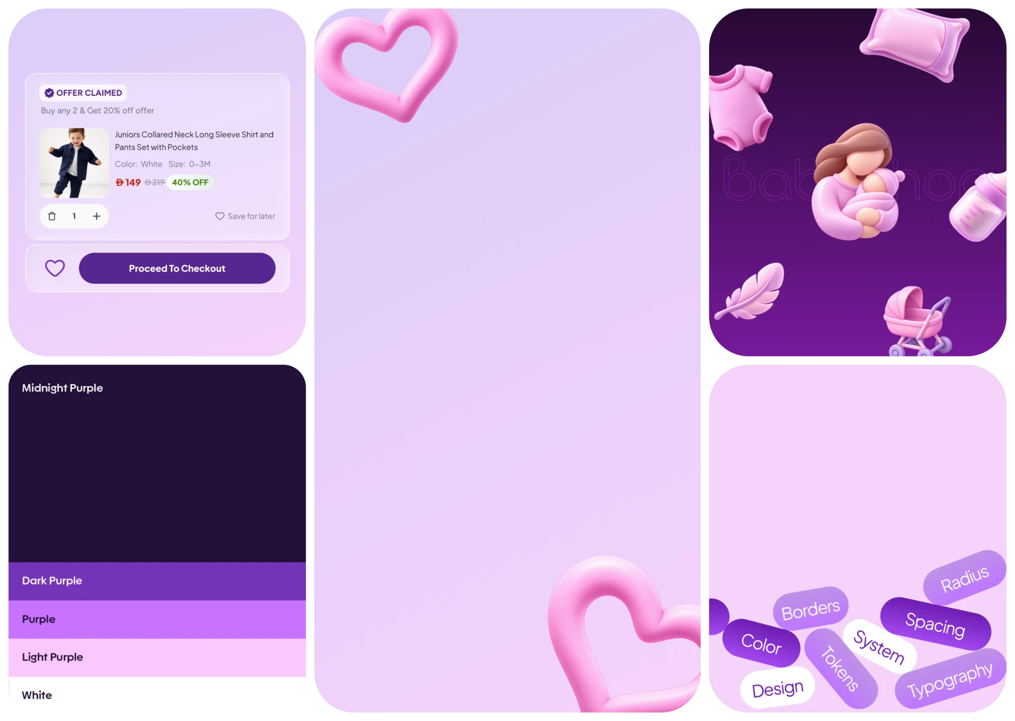
The new Babyshop brand was finished, and its launch date was fixed. There was no time for our normal phased approach, so we made each decision once and committed to it.
A finished brand, a fixed date
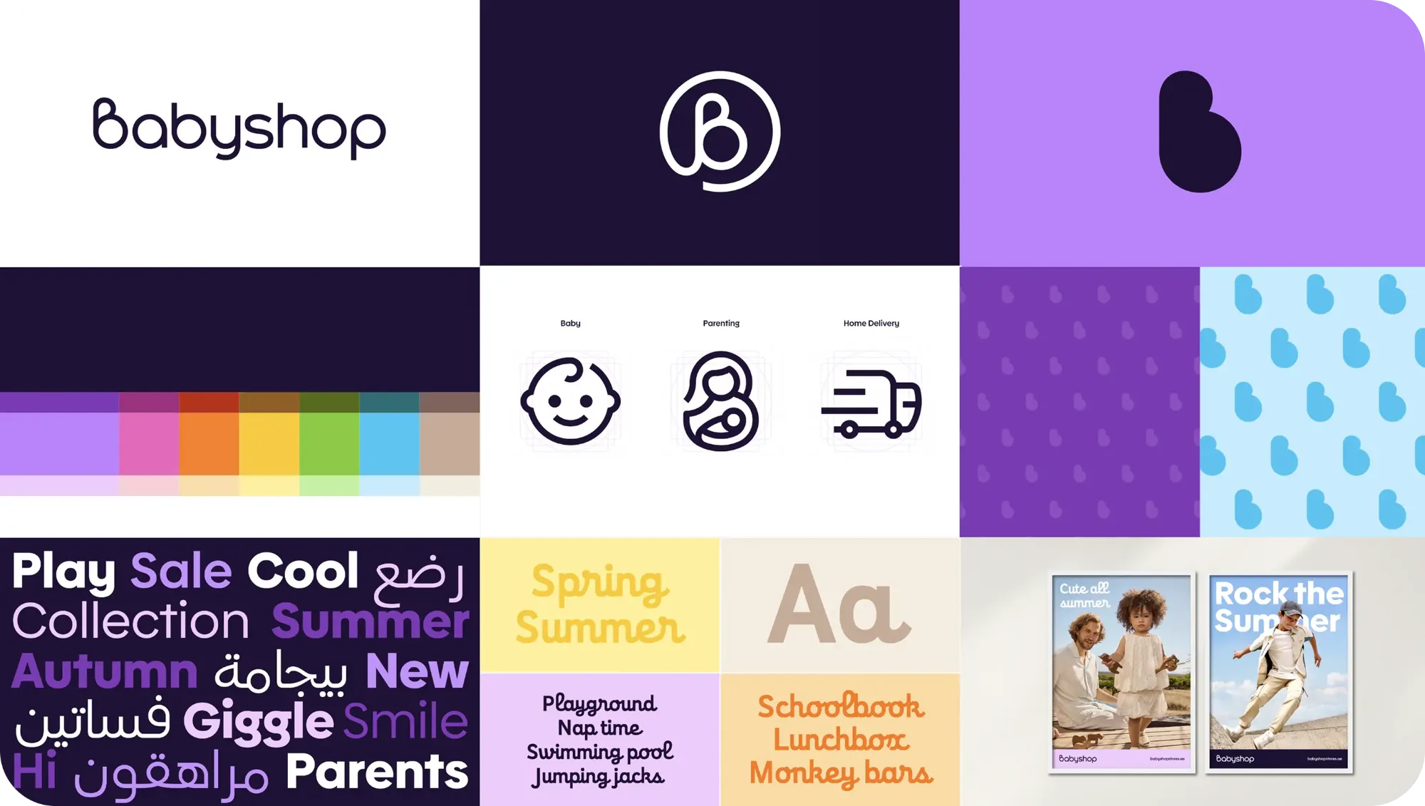
In our first stakeholder meetings, the agency’s new Babyshop identity was already almost done. Our brief was to bring it to the app, desktop site and mobile web before the official launch.
Normally we’d roll out a change like this over months, testing and refining as we went. This time, the plan had to be right from the start.
Polish, not redesign
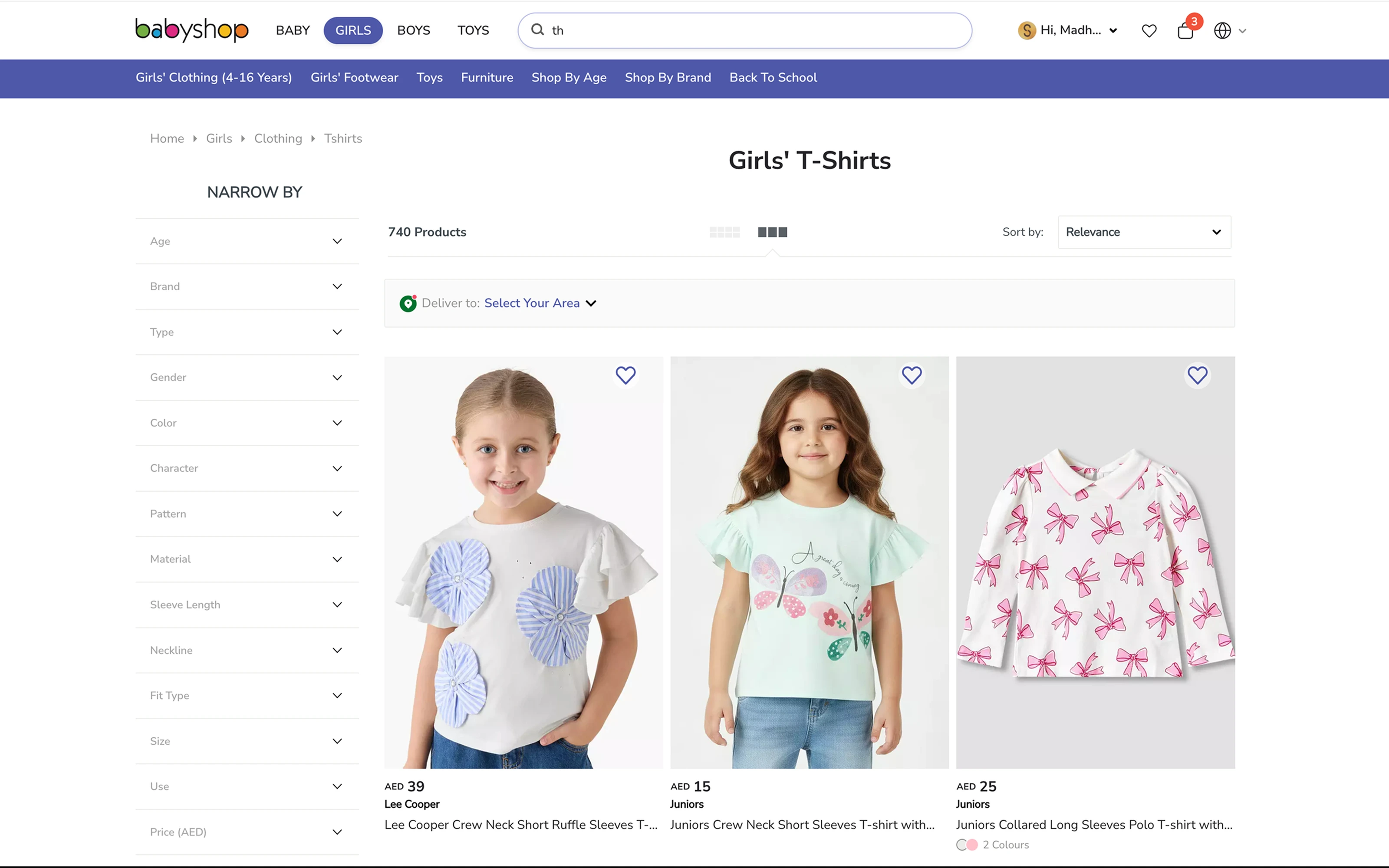
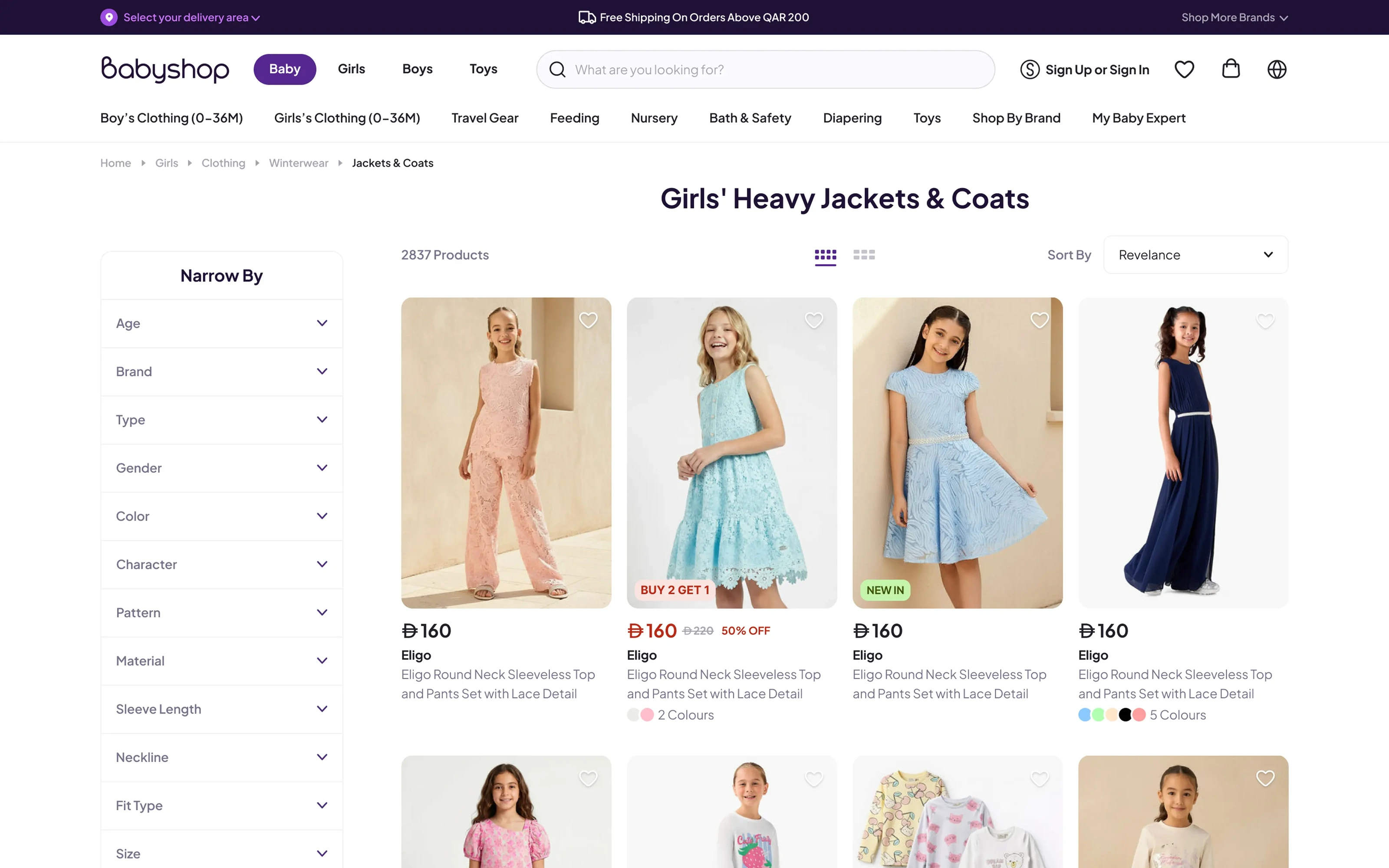
The structure of the old Babyshop experience worked, but the visual layer was dated and inconsistent. So we kept the structure and fixed the layer.
We applied the fundamentals with discipline: hierarchy, contrast, spacing, rhythm and repetition. In 60 days, consistency would do more for Babyshop than reinvention.
Tokens did most of the work
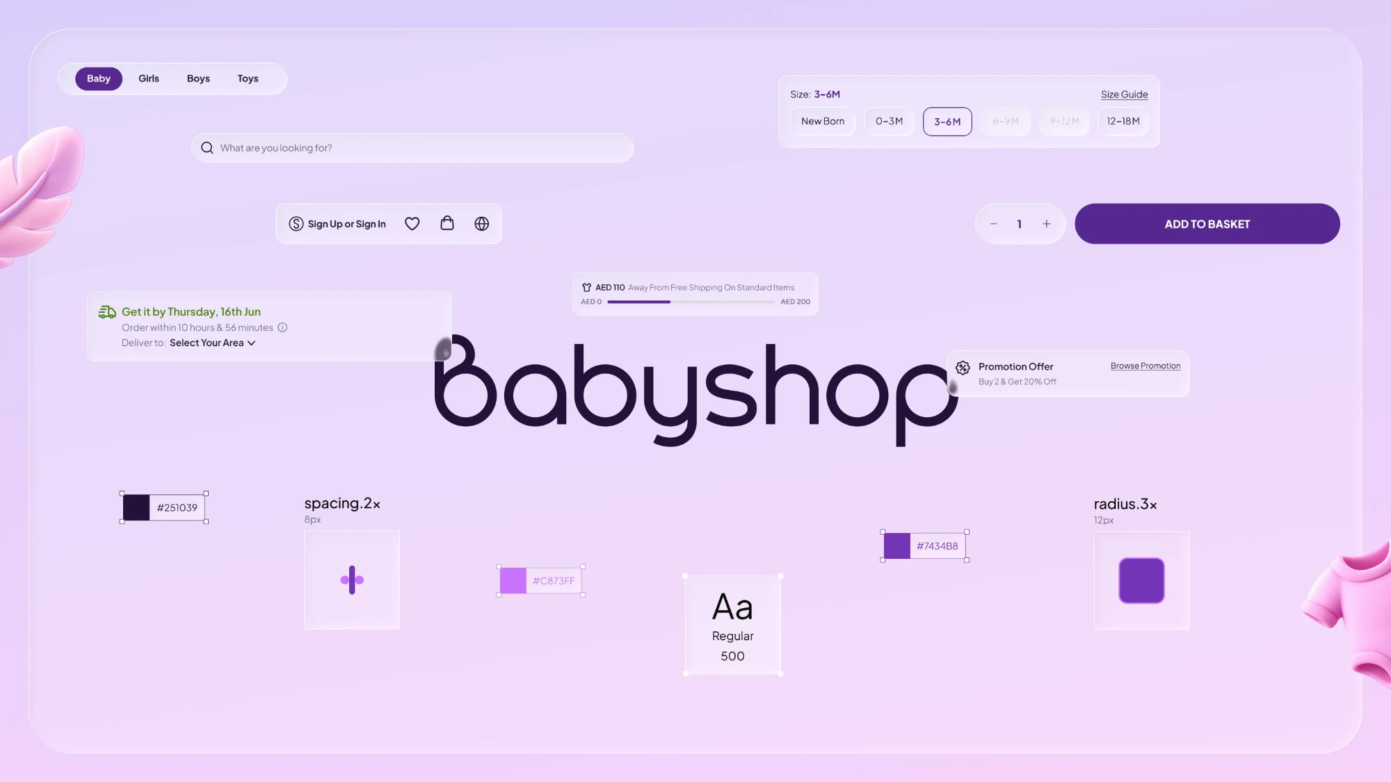
I helped build our design system, and we first shipped it on Max. That’s what made 60 days possible.
I translated the agency’s guidelines into a Babyshop token set covering colour, typography, radius, spacing and layout. Around 60% of the rebrand was applying those tokens to existing components. The other 40% was new work, and I designed those components myself.
Who did what
We split the work by experience. I took desktop, the biggest and slowest platform. My two peers took the app and mobile web.
When a page needed something the system didn’t have, it came to me, so all three platforms stayed consistent. Our lead kept us moving and made calls quickly when we got stuck.
Good enough, on purpose
The hardest part for me was the visuals. Good visual design has many layers, and with more time we’d have added more of them. Instead, I decided which layers to ship now and which could wait.
We kept the bar high. We just spent our effort where people would notice it.
Outcome
Live on app, desktop and mobile web on the brand’s official launch day. Conversion held steady through the switch.
Recognised by the leadership team at launch.
At first, 60 days felt unrealistic. I didn’t think we’d make it. What got us there wasn’t working faster. It was agreeing early on what this project would and wouldn’t be, then committing to it.
Iterating finds the best version. Sometimes the job is to find a good one and ship it.